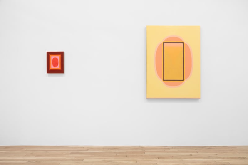
Luminous, pastel colors abound in new paintings from Lily Stockman’s solo show “The Tilting Chair” at Charles Moffett in New York. Overall minimalist in style, Stockman’s abstract works are full of circles, ovals and petals resembling the plants and flowers referenced in titles such as Camellia Japonica (2022) and Trumpet Vine (2022). She further references the natural world in bright blues and greens of abstracted skies and meadows.
The exhibition title is inspired by the Shaker design of a tilting chair, which incorporated the innovation of a small, half-moon socket installed in the back legs of a chair. The mechanism allowed sitters to lean back without slipping, thus defying the rigid nature of the chair and providing a moment of relaxation in an otherwise purposefully uncomfortable design.
The title sets the tone for the show, cueing the viewer in to the breaking down of logic and order to come. Indeed, throughout Stockman’s work, she purposefully abandons symmetry despite the seemingly balanced geometric shapes and patterns that dominate her canvases. Camellia Japonica is a perfect example of her signature style. A glowing yellow background gives way to a stripe of pink, melon-colored paint on the bottom edge of the canvas. The center of the work has a shape similar to a flower as if viewed straight down into the top of the bloom. With a quick glance, the work would appear to be roughly symmetrical apart from the sneaky pink band at the bottom, but a square in the center of the flower blossom reveals subtle details, including further bands of color and an inverted triangle whose edges give way to unexpected curves towards the top.
Throughout the show, these bright colors comprise geometric shapes and pops of details that emanate from the surface. An apparent outlier for its overall dark, subdued palette is Methuselah (2022), the name referencing the biblical patriarch symbolic of longevity as the longest living figure in the bible, lasting to the age of 969. Outlier though it may be, the piece is spellbinding. Stockman’s Methuselah is a large, two-paneled painting that is the only horizontal work in the show. The piece has a thick, burnt red band–possibly even brown–that frames two mirroring sides of a bright white, mound-like shape upon which sit three steps. A line of light yellow paint surrounds this shape. Two final stripes of color, first bright yellow and then bright orange sit atop the lighter yellow band, separating the white shape from a dark, black background. The contrast of the white and black colors with the subtle punctuation of the yellows and orange is striking.
At first, the piece appears crisp, precise and even rigid, but a closer glance reveals curves where right angles should be. The dark, black background bends as it meets the angles of the stepped orange and yellow bands. The lack of perfection is frustrating as the eye hones in on this apparent error. Why can’t the dense, crisp background meet the edges of the steps? The clean, almost rhythmic right angles of the bright steps beg to be matched with equal precision from the background. The edge of the black paint curves, as if to avoid meeting the right angles. This tension is further apparent when the painting is viewed from a few feet away as the overall symmetry of the mirroring sides crumbles. The white shape on the right side of the piece seems to be lower than the left. The eye desperately tries to realign the work.
Perhaps Methuselah isn’t an outlier after all. Moreover, Stockman’s apparent errors couldn’t be more intentional. While visually dislike any other work in the show and using a much darker color palette, Methuselah embodies the tension inherent in the tilting chair. Rigidity gives way to curves. Straight lines tilt ever so slightly. Apparent symmetry tricks the eye as differences in shape, angle and scale become more and more noticeable. Within the tension of the subtly askew elements of Methuselah, the spirit of the tilting chair truly comes to life.
Outside LA: Lily Stockman
Annabel Keenan, artillery, 29 November 2022


